Nanocloud brand kit
The logo, colors and type, plus the few rules that keep them consistent. Download the files here instead of screenshotting the website.
Logo


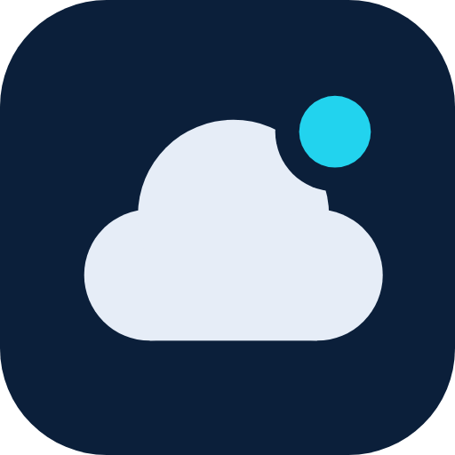

The mark is a cloud with one live node: your app, online. Keep clear space of at least the node's diameter around it. Never recolor the node anything but the accent, and don't add effects. The wordmark is nanocloud, lowercase, set in Inter Semibold with tight tracking (−0.03em). In sentences, write Nanocloud.
Color
The full token set, with light and dark values, lives in /static/brand/tokens.css. Every pair is checked for WCAG AA contrast at build time.
Type
Ship the small thing.
nanocloud_deploy(name="sprint-board") → ✓ running
Inter (variable) for everything; JetBrains Mono for code, URLs and tool names. Both are self-hosted under the SIL Open Font License.
Rules
Cyan is the brand
Use it for primary actions, links and the logo node. One accent per screen region.
Green means live
Green is reserved for "running / healthy". Never use it for buttons or decoration.
Dark first
Design in dark, then verify light. Both come from the same tokens, so never hard-code hex values in product UI.
The mascot is an accent
Use it for empty states, 404 pages and friendly moments, never in the hero or next to security claims.
Voice: plain and honest
Short sentences, concrete numbers, no hype. If something isn't shipped yet, label it "coming soon".
Icons, not emoji
Marketing surfaces use Lucide-style line icons at a 2px stroke.